24. XY Chart#
The XY Chart tool generates XY plots from simulation results for selected entities. It operates independently from the 3D model visualization — changing the plotted result or selection in the chart does not affect the contour displayed in the viewport, and vice versa.
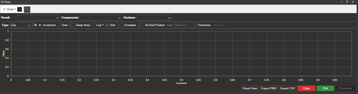
The figure below shows the panel layout, with the tabs on top, the result selectors and plot options in the middle, the chart area on the left, and the action buttons on the bottom right.
24.1. Generating a Chart#
To produce an XY plot:
Select the entities of interest (nodes or elements) in the 3D viewport.
Open the XY Chart panel and choose a Result and one or more Components.
Adjust the plot options as needed (X axis mode, averaging, etc.).
Click Plot to generate the chart.
If you want to chart the result that is already displayed as a contour in the viewport, you can skip step 2 and click Plot Active instead.
24.2. Tabs#
The XY Chart panel supports multiple independent tabs. Each tab keeps its own result selection, plot options, and chart data.
Click the + button next to the existing tabs to create a new chart tab.
Each tab can be closed individually using its × button. At least one tab must remain open.
Tabs are fully independent: plotting in one tab does not affect the others.
24.3. Result Selection#
The Result Selection group contains three dropdowns that define what data to plot:
Result: Select the result type to plot (e.g., Displacement, Stress, Force, etc.).
Components: Choose one or more result components to include in the chart (e.g., X, Y, Z, Magnitude).
Sections: When applicable, select the section point (e.g., for shell elements with multiple through-thickness layers).
24.4. Entity Matching#
The XY Chart resolves any mismatch between the type of entity you select in the model and the nature of the chosen result. The table below summarises how the four possible combinations are handled:
Result type |
Selection |
Behaviour |
|---|---|---|
Element-based |
Elements |
Result values are plotted directly for each selected element. |
Node-based |
Nodes |
Result values are plotted directly for each selected node. |
Node-based |
Elements |
The nodes belonging to the selected elements are resolved automatically, and the result is plotted for those nodes. |
Element-based |
Nodes |
The elements associated with the selected nodes are resolved automatically, and the result is plotted for those elements. |
In all cases, increments are shown on the X axis and result values on the Y axis (this can be changed — see §24.5.3 X Axis Mode and §24.5.4 Display Options). Thanks to this automatic resolution, you can select entities freely — NaxToView resolves any mismatch between selection type and result type automatically.
24.5. Plot Options#
The Plot Options group provides several controls to configure the chart:
24.5.1. Chart Type#
The Type dropdown selects the chart rendering style. The available styles are:
Line: Connects consecutive data points with straight segments.
Scatter: Shows each data point as an isolated marker, without connecting lines.
Bar: Renders each value as a vertical bar.
24.5.2. Chart Mode#
The Mode selector defines how the selected components are mapped onto the chart axes:
Linear: The default mode. Plots one curve per component, with the chosen X axis mode (increment, time, or entity ID) on the X axis and the result value on the Y axis.
2D (C1 vs C2): Plots one point per entity at the active increment, mapping two components against each other — the first component (C1) on the X axis and the second (C2) on the Y axis.
3D (C1 vs C2 vs C3): Extends the 2D mode to three components, positioning each entity in space along the X, Y, and Z axes (C1, C2, C3). The colour of each point encodes the value of the third component (C3).
The 2D and 3D modes require exactly two and three components to be selected, respectively.
24.5.3. X Axis Mode#
In Linear mode, a set of radio buttons controls what is represented on the X axis:
Increment: The X axis shows the increment index of each load case step.
Time: The X axis shows the time value associated with each increment.
Element/Node ID: The X axis shows the identifier (ID) of the selected elements or nodes, generating one series per increment. This makes it easier to study how a result is distributed across a set of entities in linear analyses.
24.5.4. Display Options#
Option |
Description |
|---|---|
Swap Axes |
Swaps the X and Y axes of the chart. |
Log Y |
Applies a logarithmic scale to the Y axis. |
Grid |
Shows or hides the background grid lines. Enabled by default. |
Envelope |
Plots the minimum/maximum envelope of the result across all loaded increments, instead of one curve per increment. |
At Grid Position |
Plots the result at the nodal position rather than at the element centroid. Useful when results are computed at integration points and an extrapolated nodal value is required (see 9.1.2 Domain). |
24.5.5. Averaging#
The Avg dropdown controls the averaging method used when plotting nodal results derived from element data (e.g., stresses requested at nodes). The available methods are:
None: No averaging is applied; each contribution is plotted as it comes from the element.
Average: Plots the arithmetic mean of all element contributions at each node.
Difference: Plots the absolute difference between the maximum and minimum element contributions at each node.
Maximum / Minimum: Plots the largest / smallest element contribution at each node.
The dropdown is only enabled when the result and selection combination produces multiple element contributions per node — for example, plotting an element-based result at nodes shared by several elements. See 9.1.3 Averages for further details.
24.5.6. Line Thickness#
The Thickness slider adjusts the line width of the plotted curves.
24.6. Actions#
The bottom-right area of the panel contains the following buttons:
Button |
Description |
|---|---|
Reset View |
Resets the chart zoom and pan to the default view. |
Export PNG |
Exports the current chart as a PNG image file. |
Export CSV |
Exports the plotted data to a CSV file. |
Clear |
Removes all plotted curves from the current tab. |
Plot |
Generates the chart using the current result selection, components, and the entities selected in the 3D viewport. |
Plot Active |
Plots the currently active contour result for the entities selected in the 3D viewport, bypassing the Result and Components dropdowns. |
Tip
Use Plot Active when you have already configured a contour in the 3D viewport (see 9.1 Contour Plot) and want to inspect the same result on a subset of entities as a chart, without re-selecting the result and its components in the XY Chart panel.